Understanding the basics of css positioning can help demystify a lot of magical components
of the web and help you control the elements in the DOM . This article is intended
to help you understand the basics of CSS positioning. The demo HTML/CSS files we’ll be working with look like this:
 The HTML has two div’s (.container and .box respectively), and one paragraph element containing some dummy text. The CSS portion styles the div’s similarly by giving them a background color, border, and padding to stand out a bit more. Here’s what it looks like on the web:
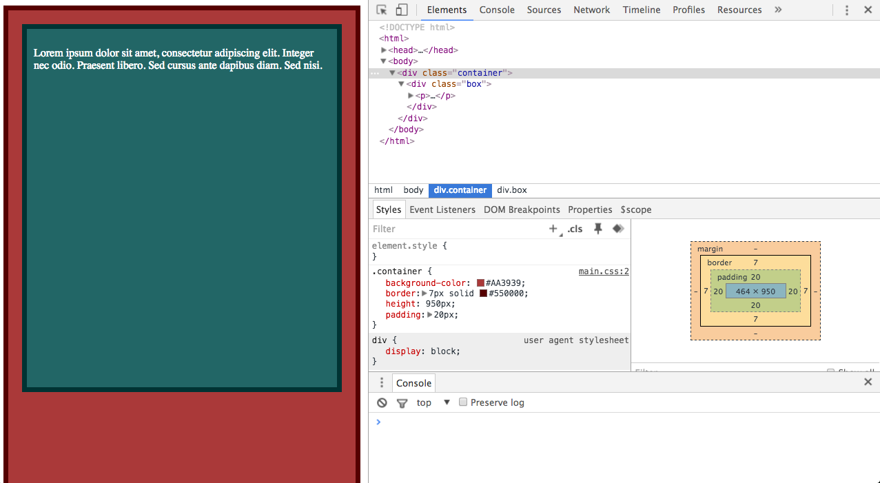
Feel free to copy the code and follow along with the article. Let’s get started!
CSS Directions
If CSS Positioning is the PB, then CSS Directions is the jam that makes up the stylish sandwich. The two are directly related to each other and influence each other all the time. There are four CSS directions:
- top
- right
- bottom
- left
They’re pretty self-explanatory. They move the element in the opposite direction by however many pixels you assign them. In other words, if I assign an element top: 10px, then that means it will be moved 10px from the top, not towards the top.
The First CSS Position: Static
So I kind of lied about the PB&J analogy because position: static isn’t affected by CSS directions. Static is the default state for many elements, and no matter how hard you try to
apply a CSS direction to the element, it won’t budge.
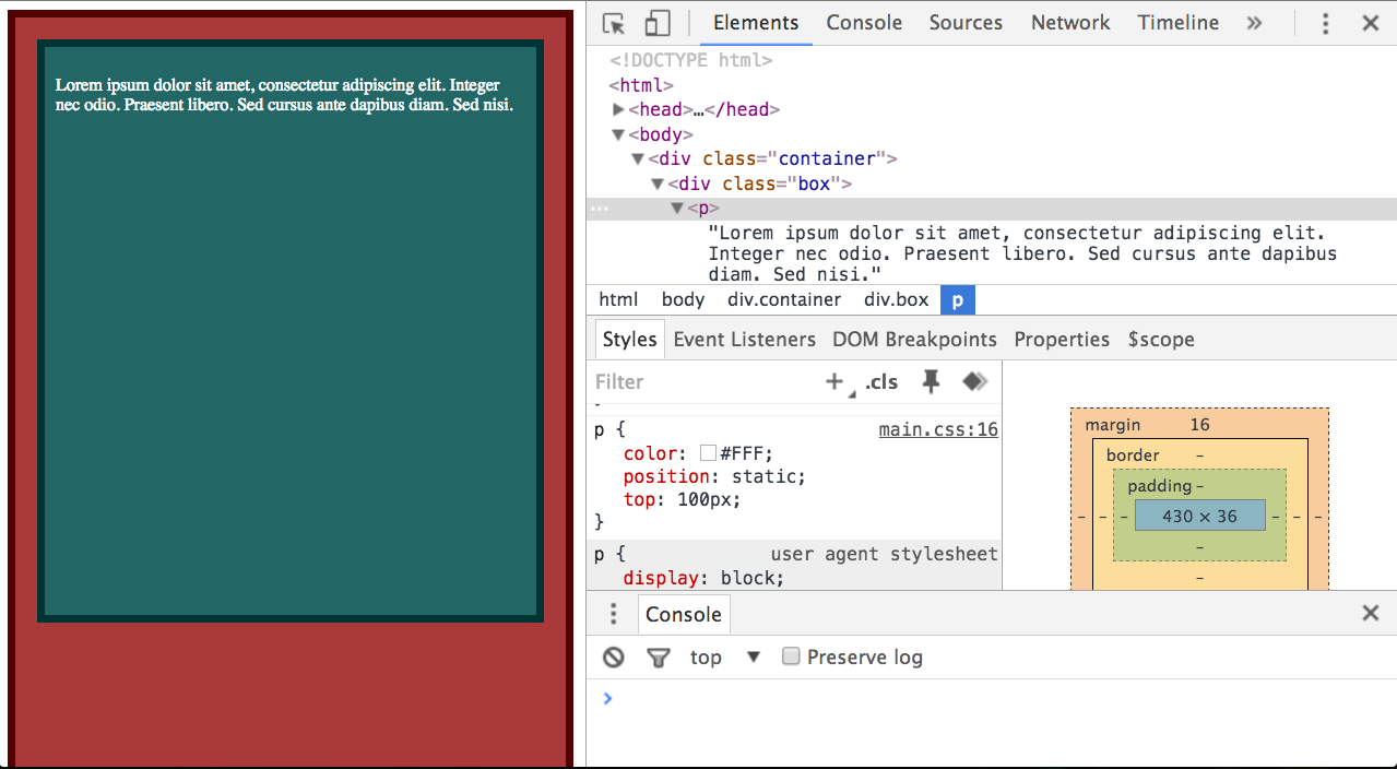 Nothing happens! But don’t worry, we’ll change that…
The Second CSS Position: Relative
…with position: relative. Now the PB&J analogy comes in handy. This attribute adjusts the position of the element relative to its original position.
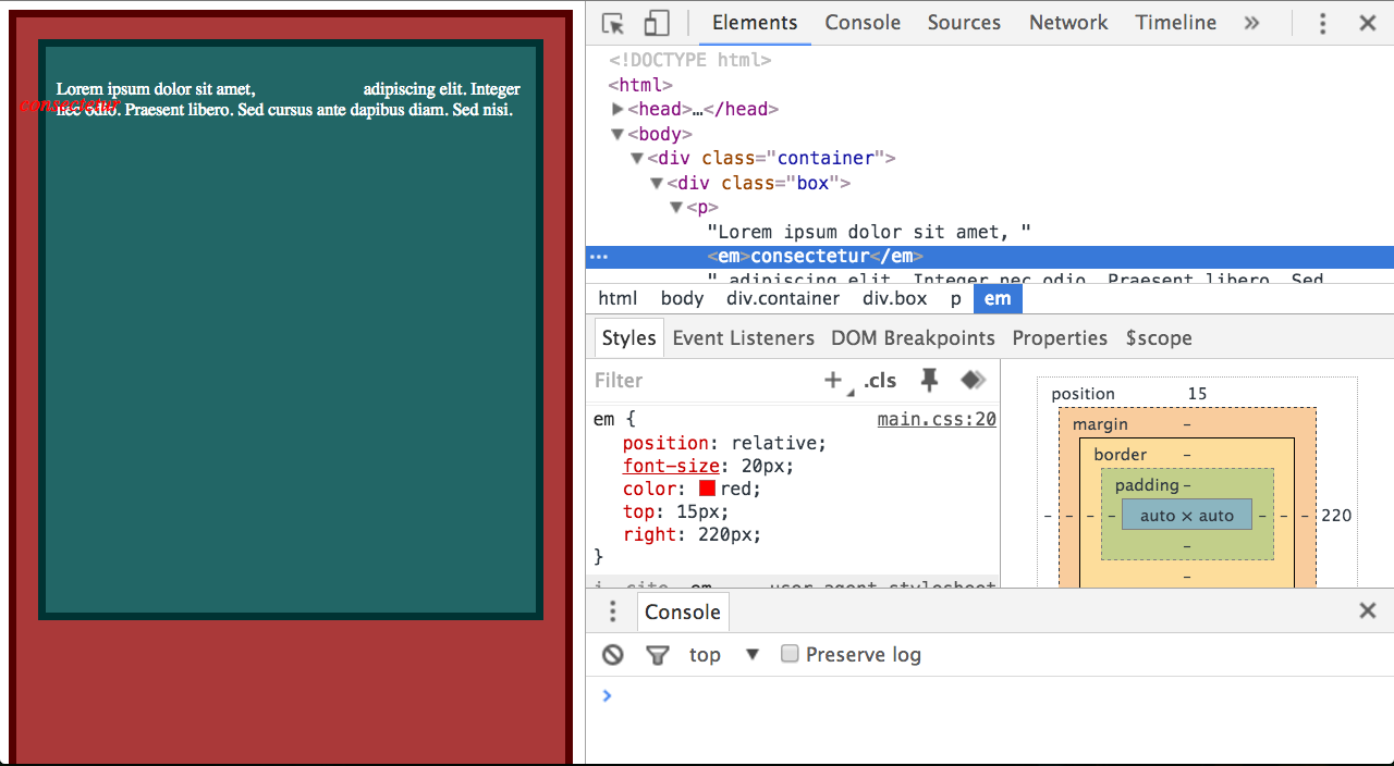
 Here, I surround the word consectetur in an <em> tag and give it a position of relative and
a top of 100px. The original position is still maintained and even shows up on the page (rendered as the missing blank). To put it in another way, the missing blank becomes the anchor and the element is positioned relative to this missing gap. From here you can manipulate the element’s position with CSS directions! The cool thing is that the element is laid out as if it weren’t positioned (pops it out of the ‘2D’ space), which means that it can ‘float’ over other elements on the page like so:
The Third CSS Position: Absolute
If you don’t want to position the element relative to its original position, and instead want to
position it relative to its container, then position: absolute is the tool for the job. Absolute
adjusts the position of the element relative to its closest declared positioned ancestor.
Ancestors with the default static position will be ignored.
For example, if I do not declare a position for .box or .container then my <em> element
consectetur will be positioned relative to the page instead. First let’s set .box’s position to relative:
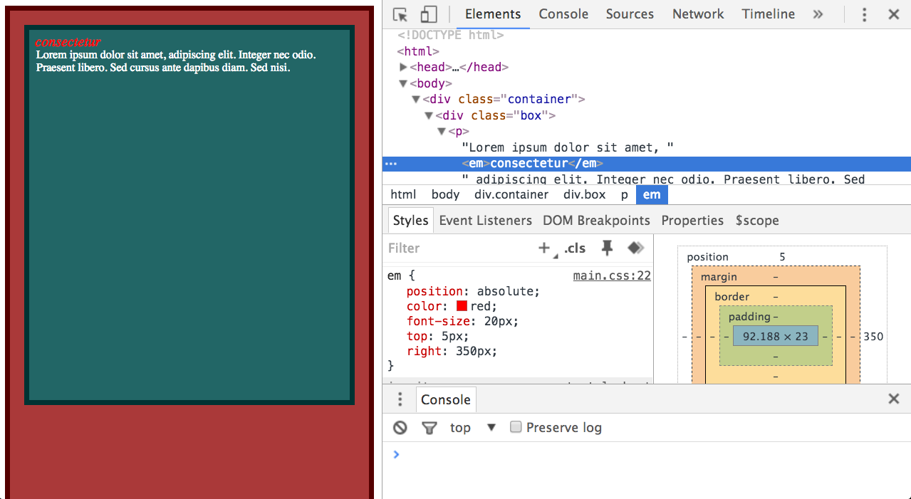 After setting the ancestor to position: relative, the <em> consectetur element’s position is then set to absolute and is pushed 5px from the top and 350px from the right. Notice that position: absolute does not maintain the original position of element, so no gap is shown.
Now, this is what happens when you get rid of .box’s declared position:
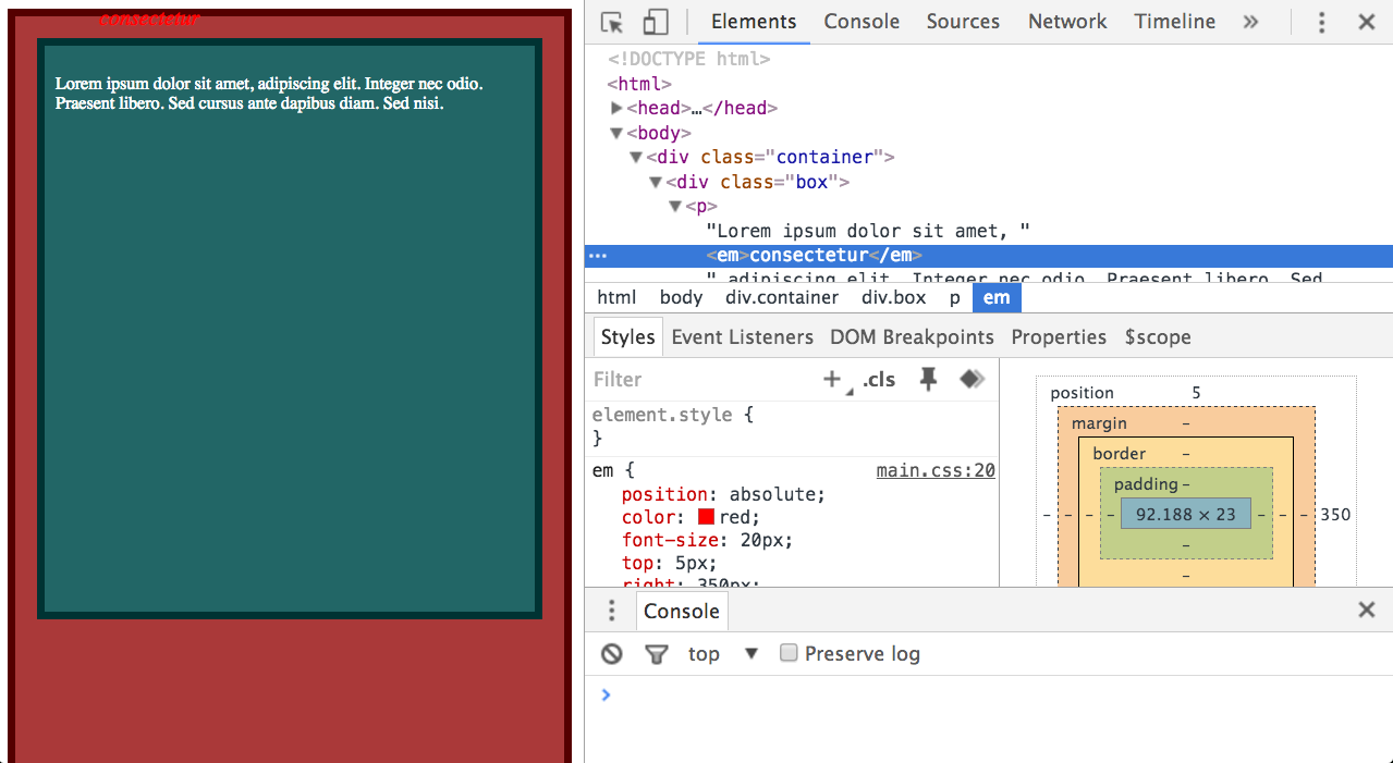 Because there is no other ancestor with a declared position, the <em> consectetur element is positioned relative to the page instead. Keep in mind that the absolute position also ‘pops’ the element out of the ‘2D’ space, allowing to ‘hover’ over other elements on the page.
The Fourth CSS Position: Fixed
The last position I’m going to talk about is the fixed position. The element is positioned relative to the screen’s viewport and does not move when the user scrolls. This time it really
is like popping the element out of its ‘2D’ space and letting it hover over the top of the DOM.
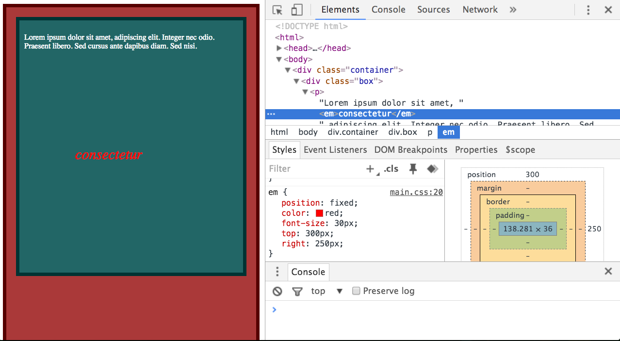 The element gets fixed to the position on the screen, even when the user scrolls, and as with
the absolute position, no space is left for the original position of the element. The fixed position is commonly used to get the header and/or footer to stick to a certain part of the page, and is a pretty neat trick.
Conclusion
And that’s the basics of CSS Positioning! I encourage you to try out these examples. The only way to get better is to try and figure out common positioning techniques before looking for the solution. Try things like making a sticky footer, centering a div, or recreating twitter’s user account page. Of course, there’s a lot more to CSS positioning and a lot of advanced topics out there, but with the basics now in hand, you can easily pick them up as you go.