CSS Lengths come in all different shapes and sizes. They all derive their units of measurement from different sources and it can be difficult to know when to use which one for your project. This article is an broad overview of CSS Lengths and contains a few tips on how to use them.
Relative vs. Absolute
CSS Units come in two flavors: Absolute and Relative. Absolute units include inches, centimeters, millimeters, points, picas, and, of course, pixels. They meet these criteria:
- These units are self-regulating
- These units are based off of real-world measurements
Relative units are much different and include percentages (%), ems, rems, exs, chs, vmax, and vmin. These lengths base their units off of one or more of these three criteria:
- These units are based off of parents’ own dimensions
- These units are based off currently declared font-attributes
- These units are based off viewport dimensions
In other words, relative lengths derive their units of measurement from elsewhere in the code. Let’s take a closer look at each one.
Relative Units
Percentages
Aside from pixels, percentages are units commonly seen in stylesheets and tend to be used a lot for responsive design. Percentages are always relative to another value and are commonly seen basing their units of measurement off ancestor elements. For example, if the .parent element is 400px wide and the .child element is 50% wide, then the .child element will render 200px wide in the browser.
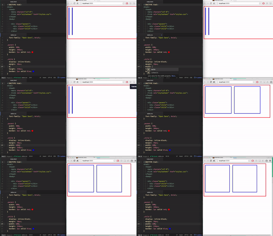
The .parent div contains two .child elements that take up 40% of the parent’s container. Shrinking the viewport scales the parent container down, which in turn shrinks the children containers as well. To retain their width size of 40%, they must scale down as well.
Developers commonly use percentages in multi-column layouts so that they can fit unpredictable viewport sizes. They are also used to make sites more responsive by assigning elements’ width sizes in percentages.
Font-attribute based units (ex, ch, em, rem)
Font-attribute based units are commonly used with fonts, as the title implies. Some are uncommon, but all are relative units.
> ex unit
The ex unit is a uncommon CSS unit. To put it succinctly, 1ex is equal to the visible height of the letter ‘x’ (the ‘x’ character makes a perfect square, so ex is technically equal to the width as well.) The actual dimensions of the letter ‘x’ can change too depending on the font-size and font-family of ‘x’, which, in turn, would change the dimensions of the ex unit as well.
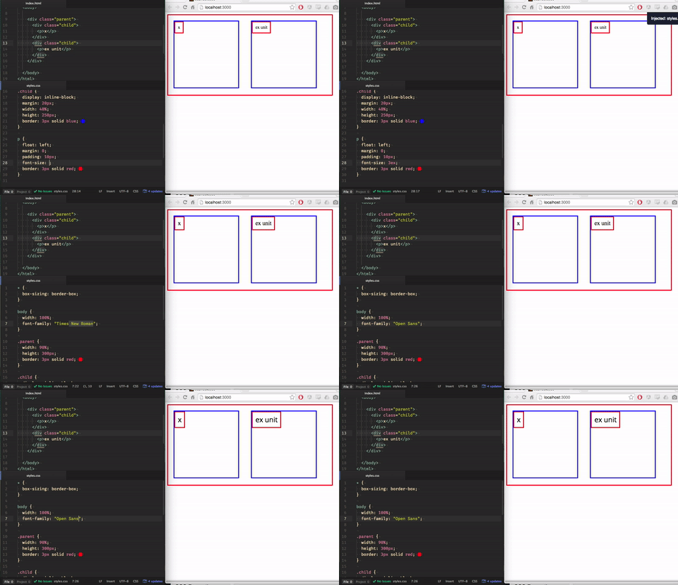
When the font-family of ‘x’ is changed from 'Times New Roman' to 'Open Sans' the ex unit adjusts itself along with ‘x’.
> ch unit
The ch unit is not as uncommon as the ex unit, but still not as popular as other values. 1ch is equal to the width of the ‘0’ character. A better way to grasp this is to turn that little guy sideways and stack multiples of ‘0’ on top of each other. You find yourself with a nifty ch ruler, too. Again, the dimensions of the ch unit will change depending on the font-size and font-family of the ‘0’ character.
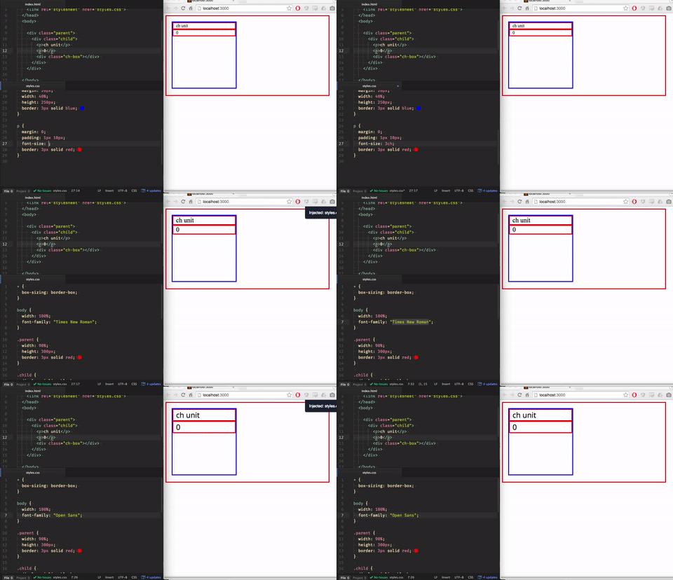
When the font-family of ‘0’ is changed from 'Times New Roman' to 'Open Sans' the ch unit adjusts itself along with ‘0’.
> em unit
The em unit is notorious for being popular and misunderstood at the same time. The most important thing to understand is that em units are based off the font-size of the element on which they are used. The browser renders em values as a multiplication of the font-size, i.e if the font-size = 20px, then 1em = 20px, 2em = 40px, etc.
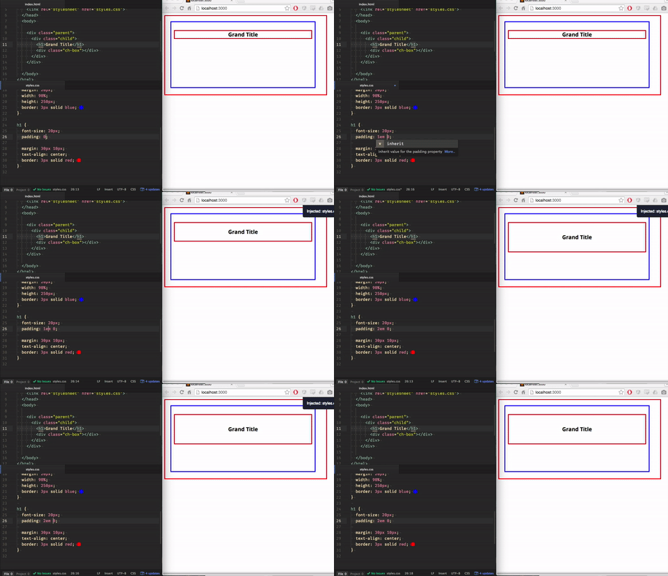
In this example, the font-size is assigned to 20px. The padding-top and padding-bottom are assigned 1em, 2em, and finally 3em. Those ems get rendered as 20px, 40px, and 80px, respectively.
The .parent element can affect these em values as well, but this only happens during inheritance (which, in fact, happens all the time because every element automatically inherits the font-size of its ancestor).
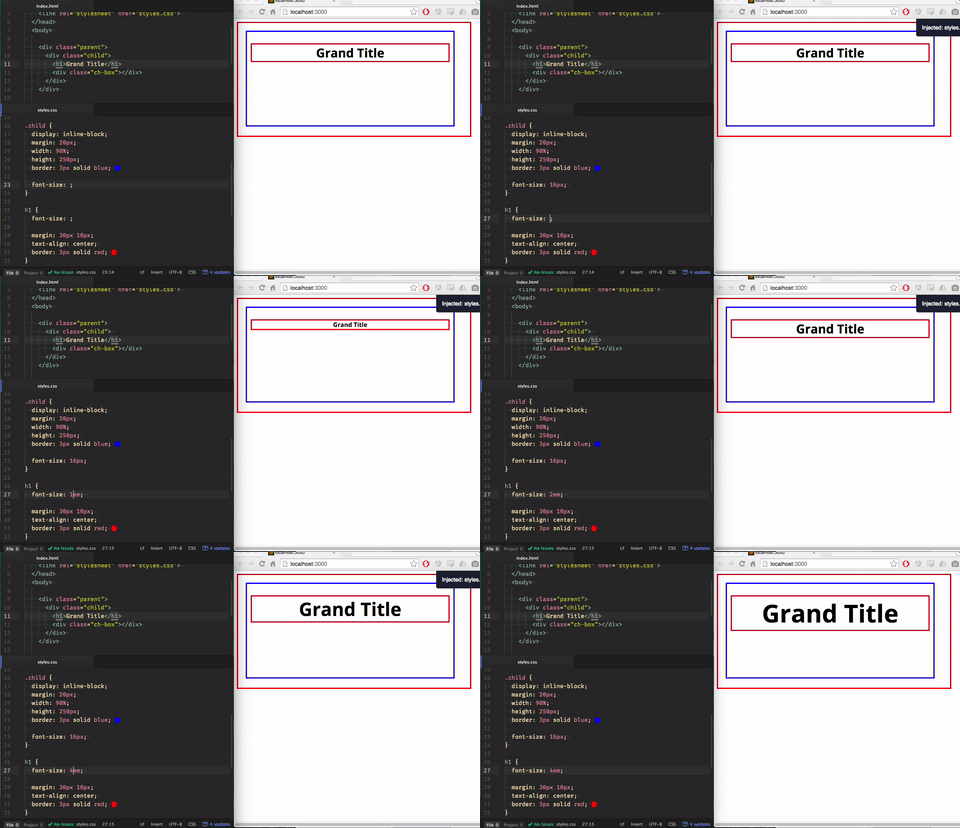
The h1 inherits the font-size from the containing element, .child. The base font-size becomes 16px which the ems can multiply off of.
em values can also cascade, which can either be a good thing or terrible thing depending on the situation:
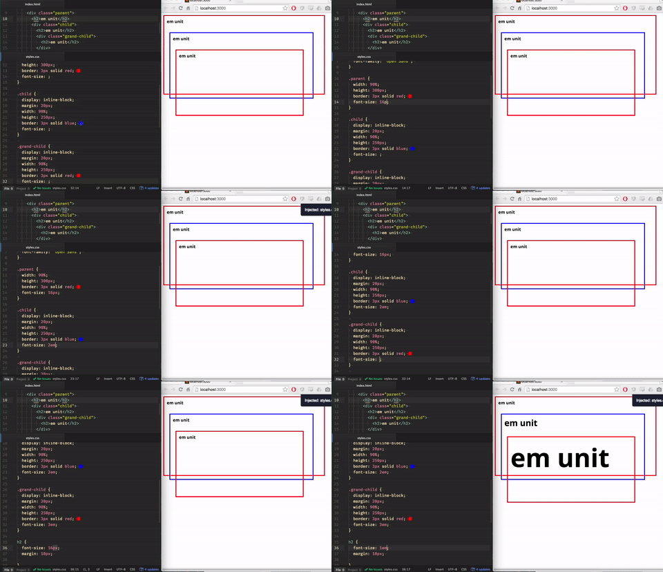
Even though all h1s are assigned a font-size of 1em, only the first h1 renders at 16px. The rest multiply to greater sizes.
> rem unit
The rem unit is similar to the em unit, however it derives its units from the root element of the page, i.e the html element. The rem unit is not cascading. This gives it a little more stability and dependability compared to the em value.
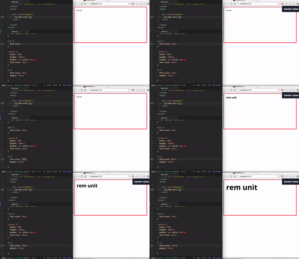
Assigning the html a font-size of 20px gives all rem values in the document a base of 20px to multiply off of. If no font-size is declared in the html, then it defaults to 16px.
em or rem?
Because these two units are similar to each other, a lot of people have trouble knowing when to use either one in their project. It’s a hotly debated topic that deserves a whole article to itself, so I won’t talk about it thoroughly here. The rule of thumb I’ve come to adopt comes from Zell’s Blog, which states:
- Size in
emif the property should scale according to it’s font-size - Size everything else in
rem.
And for another thorough analysis of this topic check out this comprehensive article.
Viewport Dimensions
The vw, vh, vmin, and vmax units divides the viewport up into 100 units. When the viewport shrinks or grows in size the elements assigned these units will respond to shrink or grow as well.
> vw and vh units
The vw and vh units stand for view-width and view-height, respectively. If an element is assigned 50vw, it will render as 50 parts of the viewport-width dimension. Likewise, vh unit is dependent on the view-height.
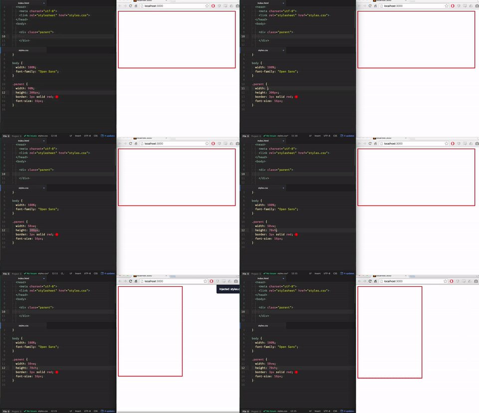
> vmin and vmax units
The vmin and vmax units of length are a little bit trickier. They still derive their values from the viewport, however, they respond only to the largest (or smallest, if vmin is being used) of the two viewport dimensions (width or height) at that moment. In other words, setting an element to 50vmax will render as 50 parts of the viewport dimension that is the largest.
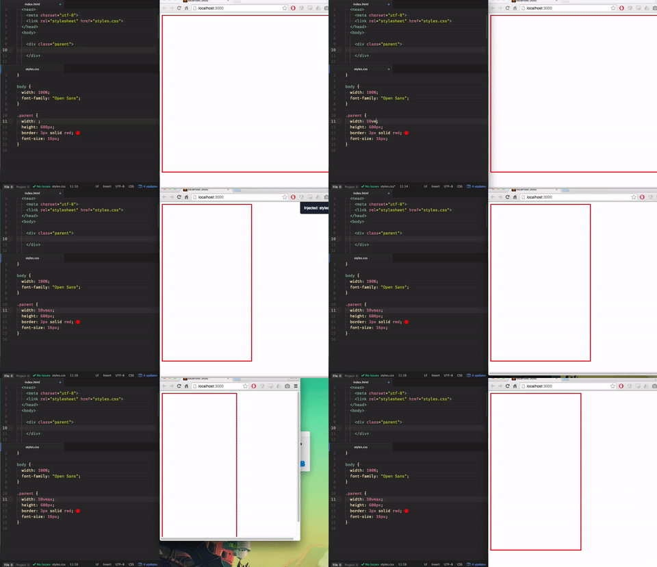
When the largest dimension begins to scale down (width in this example), the element will respond accordingly. As you can see, the element ignores the height because it is the smallest viewport dimension, until it becomes larger than the width. These principles apply to vmin as well, just in reverse:
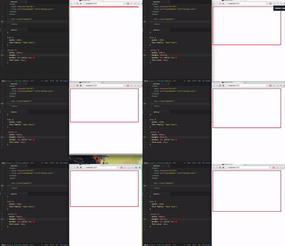
Things can get very mind-bending if you assign element’s widths to view-heights and vice versa:
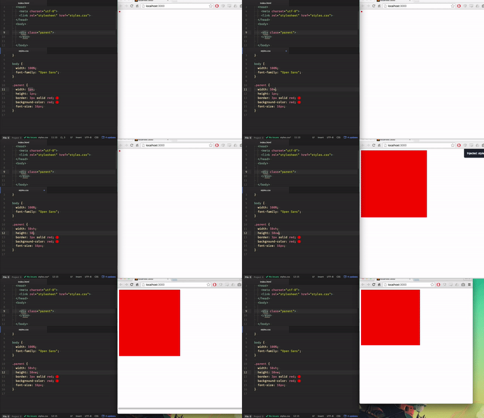
These units can easily replace percentages that determine the size of the container wrapping the whole site. These can be also be used in typography to produce interesting results.
Absolute Units
Now we head back to some familiar territory! Absolute lengths are… well, just that - absolute. They are self-regulating and are based on real-world measurements. These include inches, centimeters, millimeters, points, picas, and, of course, pixels.
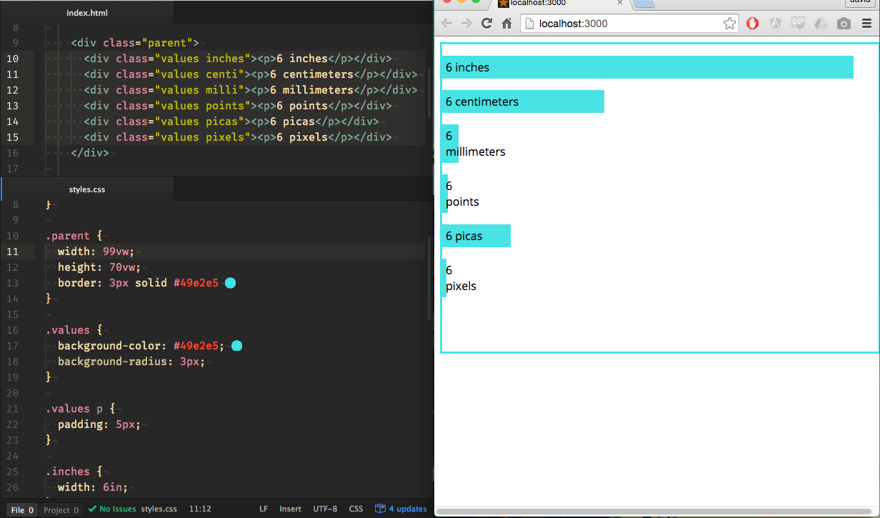
You can read all about absolute values at the W3C along with all the math goodies.
A Word About Pixels
The most common unit seen on the web is the pixel. Most people find themselves thinking in pixels when determining the dimensions of an element because its the easiest. However, the size of the pixel can vary from device to device.
Screens come in all shapes and pixel-sizes, otherwise known as pixel densities. Text can look huge on a large, yet low pixel-density, monitor, taking up more than the screen. But the text suddenly shrinks to half the screen-size when you open it up on an high pixel-density iPhone, despite the it having a physically smaller screen. Just something to keep in mind, especially when designing for mobile.
Conclusion
As we now know, CSS lengths fall into two categories – relative and absolute. We’ve learned some uncommon lengths and some very common lengths. We’ve also learned the difference between em and rem. From here, you can dig deeper if you want and check out the sites I linked above. Or you can hit the ground running by playing around in your own project. Hopefully you can now answer the question in the title! Until next time :)